| Author |
Huge Sony Ericsson Portfolio for 2007 |
shyam335
Joined: May 25, 2004
Posts: > 500
From: 127.0.0.1
PM |
Thanks for the pics,
keep 'em coming 
I dont like silver ai.
There are a terrible lot of lies going around the world, and the worst of it is half of them are true - Winston Churchill
We shape our buildings; thereafter they shape us - Winston Churchill |
|
|
DragonEye
Joined: Sep 26, 2002
Posts: > 500
From: Canada
PM |
wow is the ai ever an ugly phone...
Shaolinmonk on HOFO Official PHONE JUNKIE
My P1i Review
http://www.esato.com/board/viewtopic.php?topic=152437&start=0 |
carlzeiss
Joined: Dec 13, 2006
Posts: 3
PM |
Quote:
|
On 2006-12-13 18:14:14, londonlad123 wrote:
@Carlzeiss
Do they support HSDPA?
Cheers for the pics! Seems like 'c' is the power key.
Show us the side !!
[ This Message was edited by: londonlad123 on 2006-12-13 17:19 ]
|
|
The AI is is W880i, it only has 3G. |
T-mobile
Joined: Nov 12, 2002
Posts: 222
From: Greece
PM |
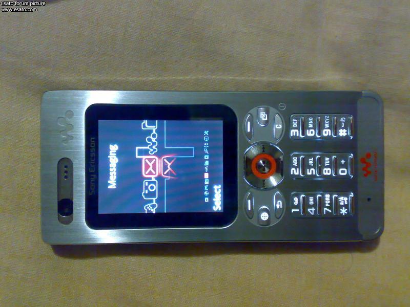
I personally find the Ai (W880) extremely beautiful, with a high tech design. I can't say if the silver is nicer that the black one. We have to see more pictures from the side and back.
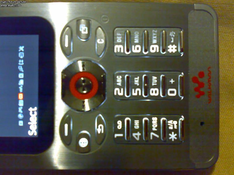
I think the little keys are nice, and shouldn't be hard to press because the look that they have a good spacing between them, at least from the pictures.
Really nice handsets, looking forward for the big announcements.
Thank you carlzeiss for the photos. |
carlzeiss
Joined: Dec 13, 2006
Posts: 3
PM |
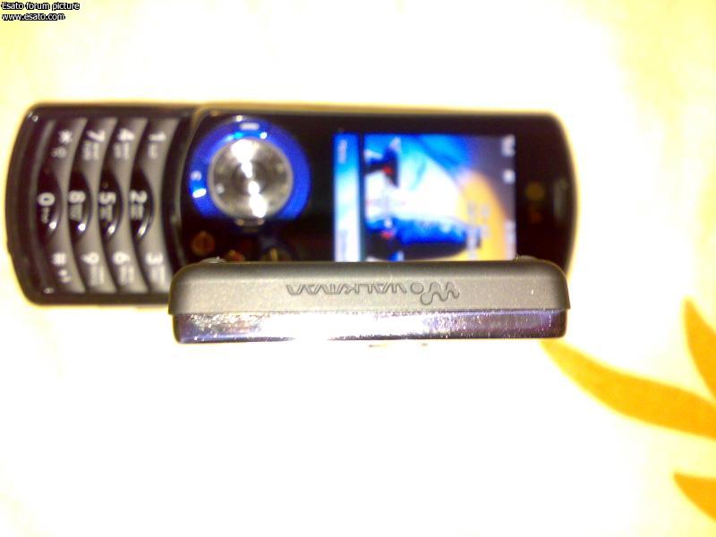
Some more pics.
 |
Tiny
Joined: Dec 04, 2006
Posts: 165
PM |
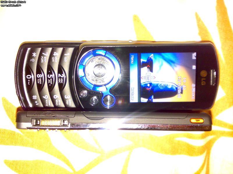
That last one looks like the new LG phone thats out with the DJ disk
|
n3o
Joined: Sep 02, 2005
Posts: 427
PM |
come come come SE lawyers:):):);) |
gauravsali
Joined: Oct 14, 2006
Posts: 248
PM |
why sdisplay is small??what r specs of these phones????/they r not too gud!!!they r not advanced too. i didnt find them very appealing than previous phones. what about their cameras |
n3o
Joined: Sep 02, 2005
Posts: 427
PM |
@shaliron
do you still think it is ugly...ok the silver one is...but the black one is a beauty:) |
DragonEye
Joined: Sep 26, 2002
Posts: > 500
From: Canada
PM |
wow... thanks for the pics... all ugly phones.. though.. but the slider... let's see that one.. it looks like it has potential
lol nevermind it's just the ai turned the other way lol
_________________
Shaolinmonk on HOFO Official PHONE JUNKIE
MyProfile http://www.howardforums.com/m[....]s=&action=getinfo&userid=20841
[ This Message was edited by: DragonEye on 2006-12-13 18:38 ] |
jack00
Joined: Feb 20, 2003
Posts: > 500
PM |
extremly stylish, this one is going to sell like hot cakes! |
amawanqa
Joined: May 08, 2004
Posts: > 500
From: Hornchurch UK & East London SA
PM |
I like the brushed metal look of the silver one, but that black one with the additional orange accents (on the keypad) looks the absolute biz, IMHO.
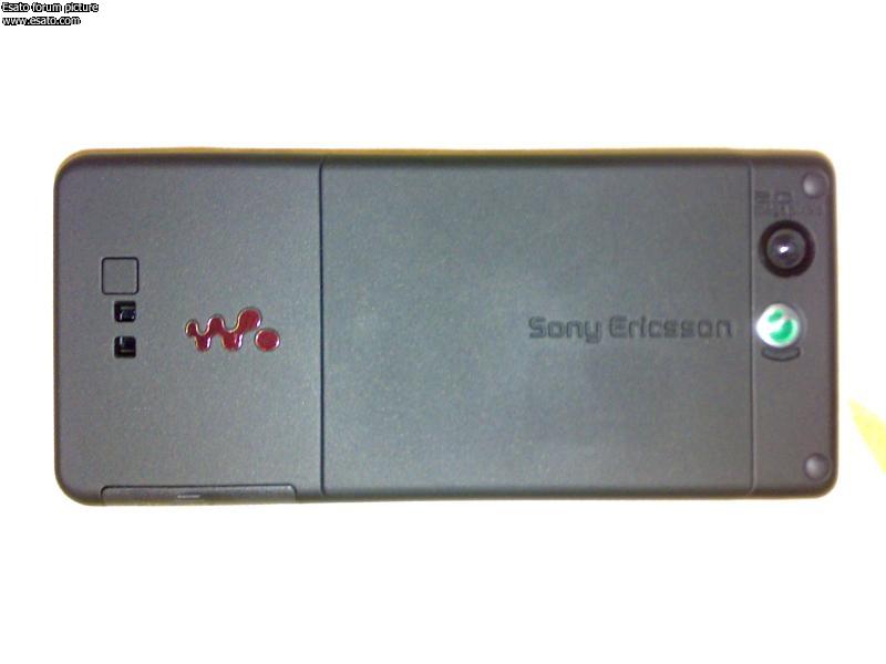
The back looks really spartan though..there is a certain beauty in minimalistic at times; but I haven't warmed to this one yet...
He who laughs last... thinks slowest.
Nokia 5800, Sony Ericsson P1i, Nokia 7600. |
B-M
Joined: Apr 27, 2006
Posts: 2
From: Hollandio
PM |
It looks a bit like a ipod from above! |
DeLa
Joined: Jan 22, 2003
Posts: > 500
From:
PM |
That Ai looks like a flattened out k600i: same material, same placing of the screen (with the black frame around it) and the 'broken off' circular buttons around the center key. Might be nice in reality, usually those 'spypics' do no good to the phones. |
fersantos20
Joined: Dec 13, 2006
Posts: 8
PM |
Wow, ugly, but at least the menu looks nice, and on the photo from above, it has a "iPoddish" kind of look |
|
|